Exploring Simplicity
Less is more with minimal web design.
We agree, "less is more" is probably one of the most often-heard mottos, whether discussing design or lifestyle; but minimal web design isn't so much a specific design aesthetic, rather a set of principles.
Minimalism focuses on creating compelling designs with less going on. There are keys to achieving this — a few of our team's secrets too — and we'll explore building a beautifully-designed, minimalistic website.
Don't confuse "less is more" with true minimalism
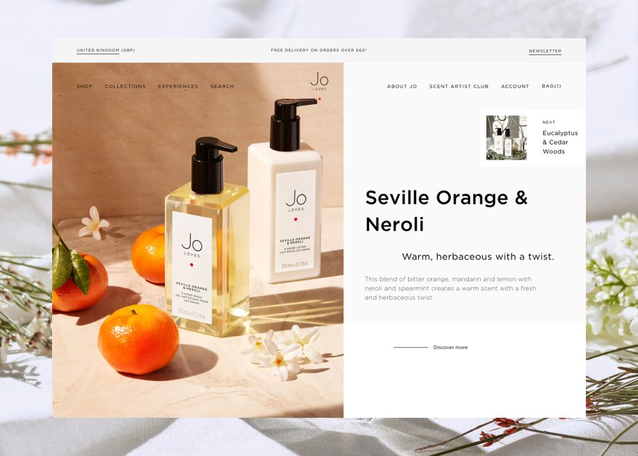
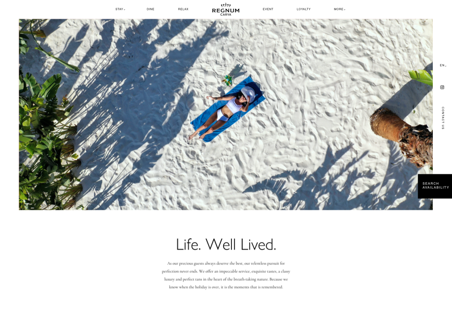
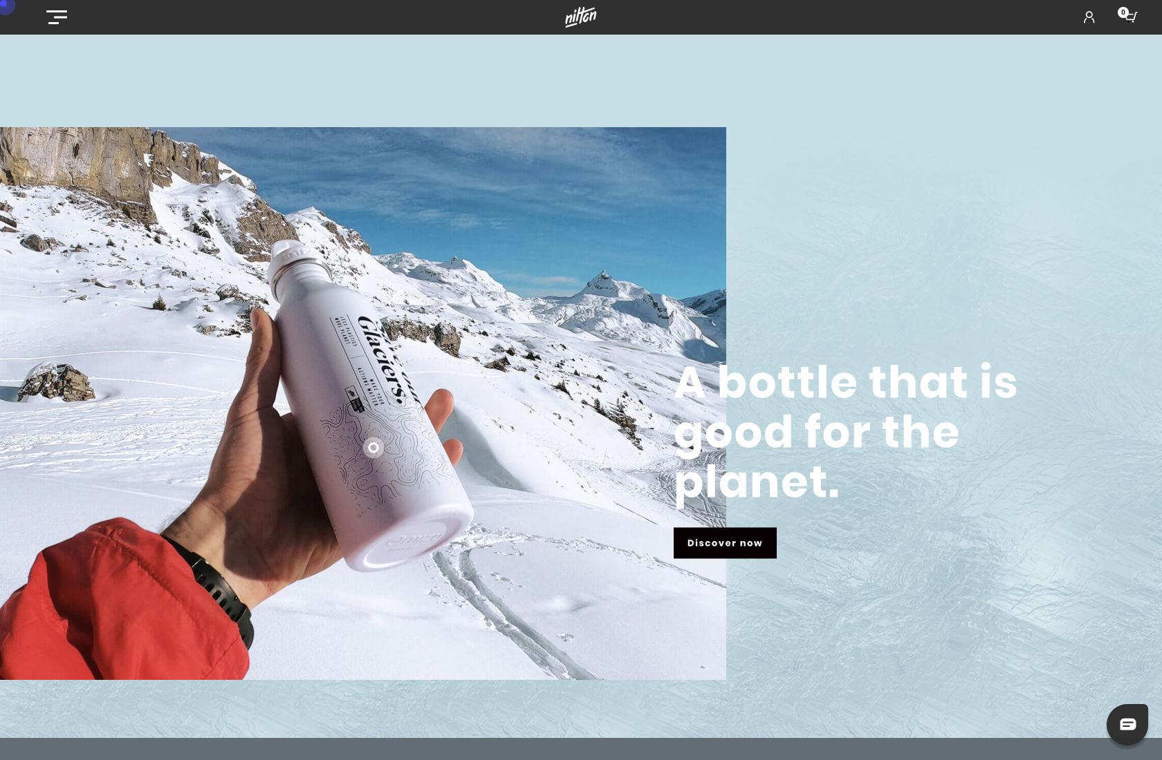
Minimalism is the first choice for many artists, photographers, designers, and even writers for one reason: to standout and shine! But, many confuse minimalism design with the "less is more" aesthetic. Compare the following two websites:

Both websites are designed beautifully, and each has less going on than the average site; but, which is truly minimal?
This may surprise some, but the answer isn't both. Between the animations, textured background, elements, and custom typography, the top website isn't considered minimalist. It’s not that any particular element alone makes it not fit the minimalist web design definition, but rather the combination of all of those elements.
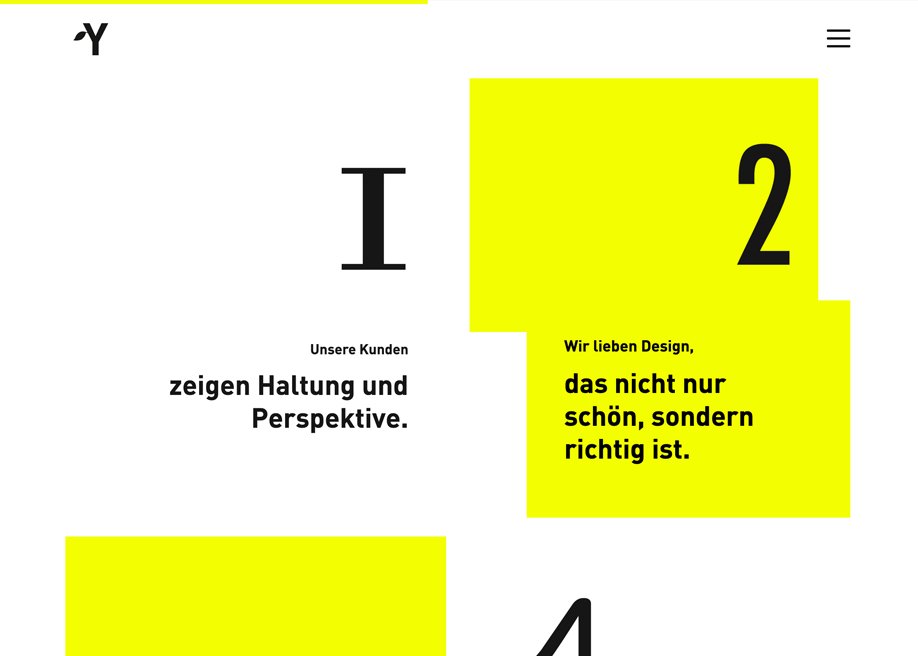
The bottom site get's straight to the point: standout and shine. Many of our clients (both individuals and startups) are signing off on minimal user interfaces because it showcases their content in the clearest layout possible.
It has to be intentional
On the surface, minimalist design looks easier to master than other traditional design styles, but the opposite is generally truer.
Minimalist design puts every single element front and center for your users; and while more visually complicated designs can make small mistakes or missteps practically invisible, simple website designs don’t offer the same coverage.
An insider tip: guide your users. When creating a minimal website or app, act as if your users are children crossing a busy Times Square intersection...hold their hands, guide them to the other side.
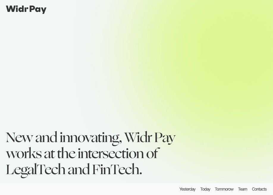
Make use of "Negative Space"
Possibly one of the most important elements of a good minimalist web design is the use of negative space. Minimalist design is just as much about what isn’t there as what is.
Negative space, also referred to as “white space,” is the empty or open space around design and/or content elements that gives them definition. Granted, sometimes this space isn’t always truly empty, and may be filled with a background texture, pattern, or color. But it’s still space that isn’t being “used” in the same sense as other elements of the site.
Keep Navigation Simple
One area where a lot of minimalist sites break down is in creating user-friendly navigation. This is particularly common on more complex sites with a lot of pages.
Top navigation bars are still a mainstay in minimalist design. Simple text links, sometimes with sub-menus, are the most common. The typography, colors, shapes, and other design elements can be adapted to fit the overall look and feel of the site. But there are other options.
Two other very common navigation design patterns found in minimalist web designs are the hamburger and kebab menus. Hamburger menus consist of three or four horizontal lines (variations sometimes use vertical lines, but the idea is the same), while kebab menus consist of three dots.
Above is a great example of a kebab-style menu.
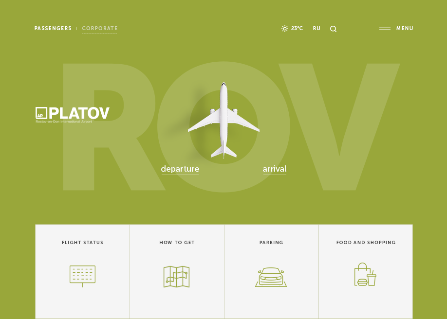
Even high-traffic sites like Platov airport use a minimal menu style.
Despite having been fraught with usability problems, the infamous hamburger menu above — which has become a universal shortcut to hide navigation — is here to stay because it reduces visual clutter.
Most commonly, hamburger menus will be used for main navigation, while kebab menus might be used for things like settings menus or other sub-menu types. While both are becoming more common navigational elements, some designers still add text to indicate that the hamburger is a menu. This is particularly useful if a site isn’t aimed at tech-savvy users.
Color Palettes
There are a number of opinions on what makes a minimalist color palette. Plenty of minimalist sites use only two colors; others use three, four, or more. A color palette alone will not make or break a minimalist web design.
Consider this insider tip: dark mode.

There are a lot of possible approaches to creating a color palette for a simple website design. But like all elements of a minimalist design, each choice needs to be intentional, and improve the overall user experience.
Consider this insider tip: dark mode.
Conclusion
The biggest challenge with minimalist design is that there is nothing for designers to hide behind. Each element of the design must prove its worth; each element must be chosen deliberately, and be implemented perfectly.
Web designers who approach minimalist design believing it may be easier than other design styles are often surprised at the amount of effort, time, and skill required to create a UI that can achieve its aims in terms of user behavior and experience while maintaining a truly minimalist aesthetic.
Want to pursue minimal web design, but stuck on something? Simple Digital has an extensive portfolio of minimalistic web design and re-branding. Give our team a call or send us an email and we'd love to help you out!