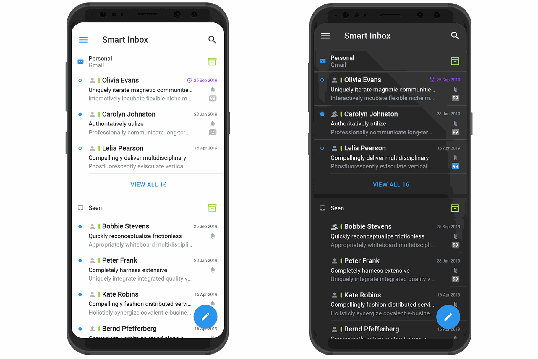
Dark Mode
Dim the lights, relax your eyes, and save on real-world energy costs.
Dark mode is one of the biggest trends in design. So why are our clients and world-class brands like WhatsApp, Instagram, Google, Facebook and Apple jumping on the dark mode design train?
Let’s dive into the secrets of dark mode and how you can bring a fresh UI into your own designs. You’ll learn the pros and cons of dark mode and best practices when applying to make sure your web and app designs look and function perfectly.
What is "dark mode"?
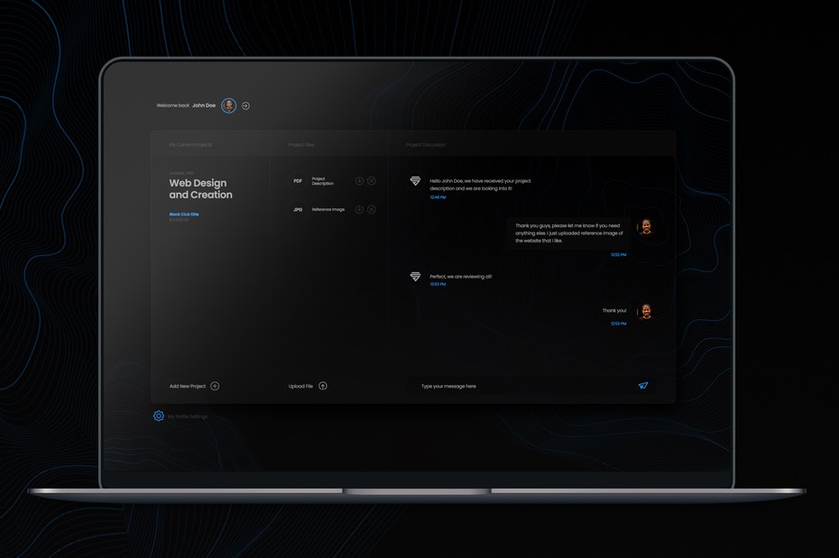
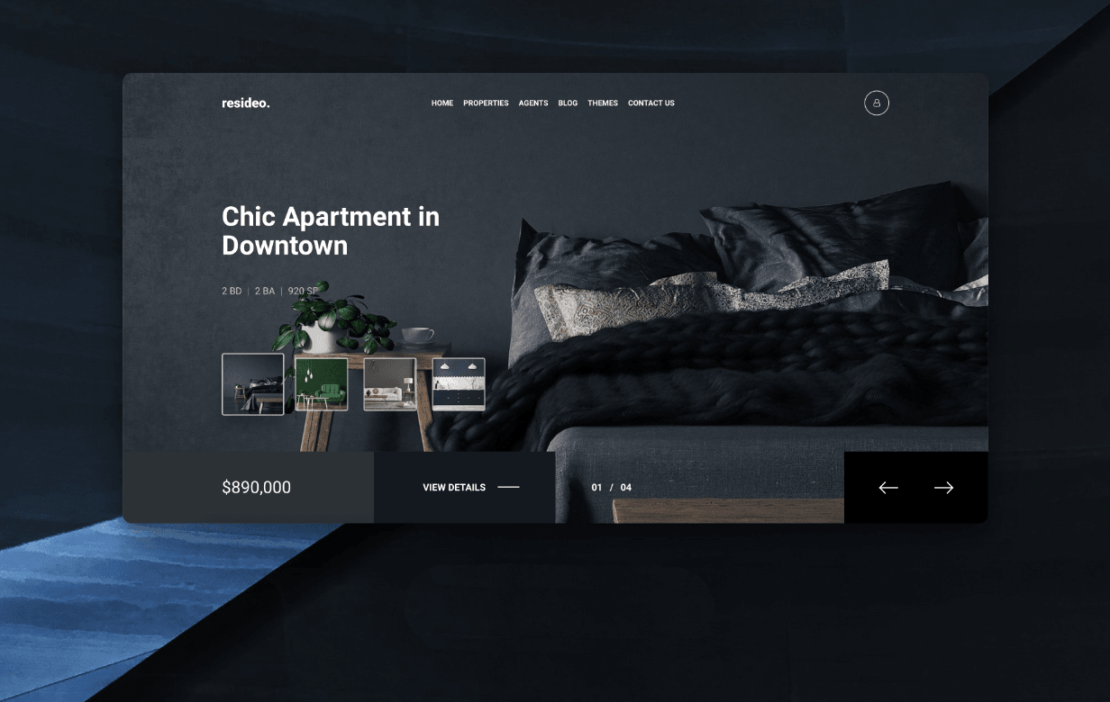
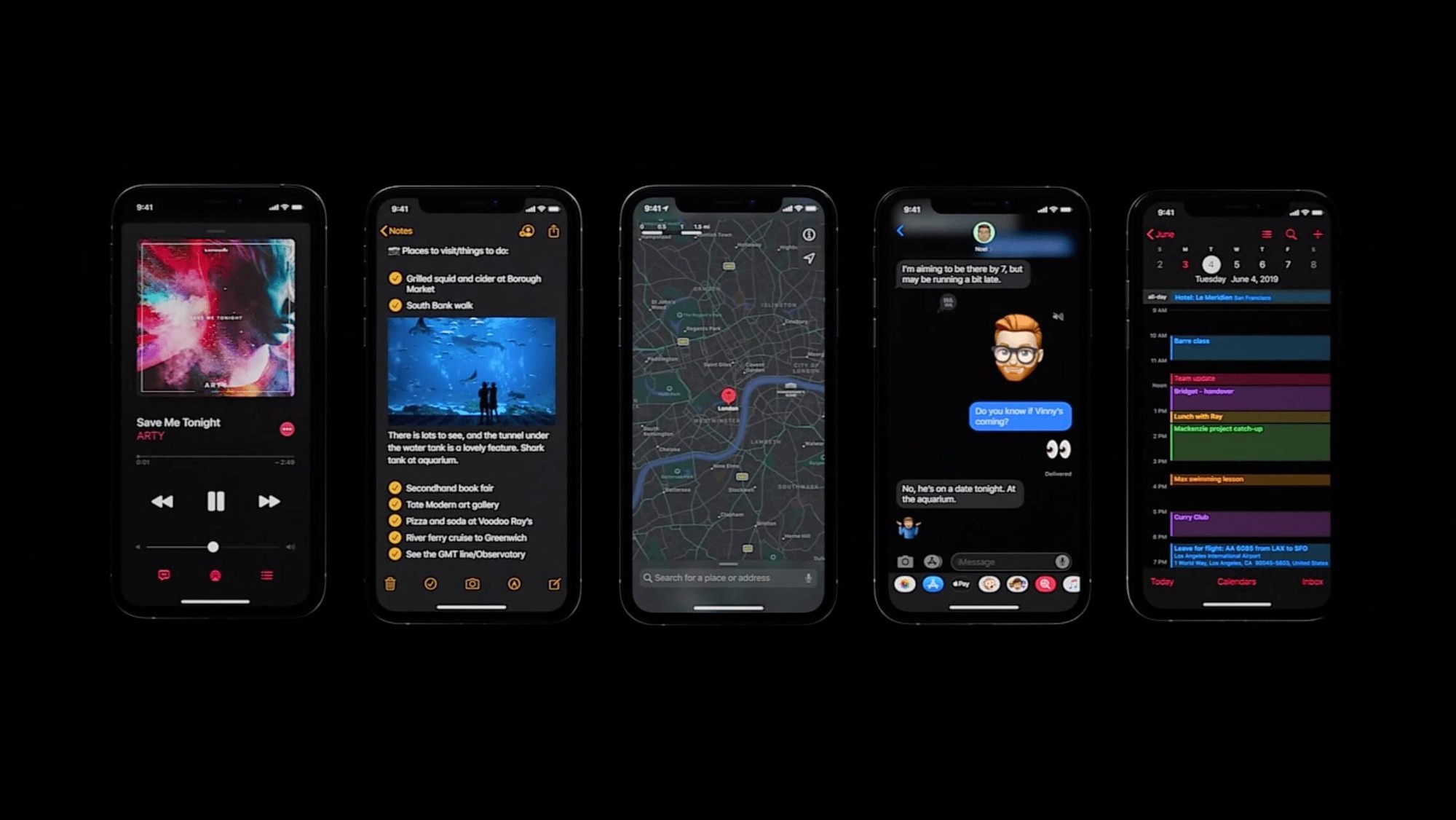
Dark mode is a low-light user interface (UI) that uses a dark color — usually black or a shade of grey — as the primary background color; think of it as the reversal of the white UI that designers have used for decades.
So why the switch now?
That answer became more clear since the invention and adoption of smartphones. As screen-time has increased year-over-year, a growing health concern became more and more prevelant: eye strain. To defeat this, developers discovered that using a "dark theme" interface helps users with this issue, which meant fewer headaches and a better working and reading user experience.
But that's not the only reason why designers are using it.
Pros of using dark mode
When designed properly, not only is dark mode easy on the eyes, but it saves battery life and even can be healthier. Let’s check out the practical advantages of dark mode vs. light mode.
Reduces eye strain
You’re not supposed to feel your eyes. But, anyone who analyzes data on a screen or reads a book on their tablet knows that after a while, you start to. Computer Vision Syndrome (CVS) includes eye pain, blurred vision, double vision, headaches, neck/back pain and more. When it comes to charts and graphs, dark mode can literally reduce the pain.
Saves battery life
A growing number of phones, tables, and screens are installed with OLED screens that can automatically switch off black pixels when they’re not in use. And because dark mode uses an increased number of black pixels, this forces the device to use less energy.
Increases visibility in low-ambient lighting
If you’re asleep and someone turns on a bright light, you may get a quick burst of eye-strain, perhaps leading to a headache. The same principle operates with people working in front of a computer screen late at night or early in the morning. Dark mode reduces that bright light and makes it easier to see content in low-light situations.
Can prevent ADD
We're not doctors; but as experts in user-interface design, white light and colors tend to drift users' attention, which can increase the difficulty of a task. We solve this using a dark mode UI, directing the user's concentration toward the content and have the background subconsciously disappear.
Cons of using dark mode
Like with anything in regards to design, dark mode has its disadvantages too. Familiarize yourself with these as they could be a major drawback.
Nearly zero emotional connection
Simple Digital is all about creating that connection between your website and the users, and one way of doing so is by using colors; however, what's something that doesn't have colors? You guessed it: dark mode. Generally speaking, bright colors create bright emotions. If that’s what your viewers are looking for, then dimming the colors down may create a mental barrier with them.; they’ll have a harder time making an emotional connection with the dark theme. If your brand is motivational, inspirational, or spiritual in nature, dark mode UI can be a gamble. If bright colors can create bright emotions, the opposite can be true. So, ask yourself: who’s your audience? Don't give them something they may not want.
From our editor: It may be difficult to wrap a "happier" or "brighter" brand around dark mode, but not entirely impossible. I highly recommend contacting our UX/UI team if you're on the fence.
Can be hard to read
When designed improperly, dark mode can make text harder to read; keep that in mind when creating a dark mode app, or website.
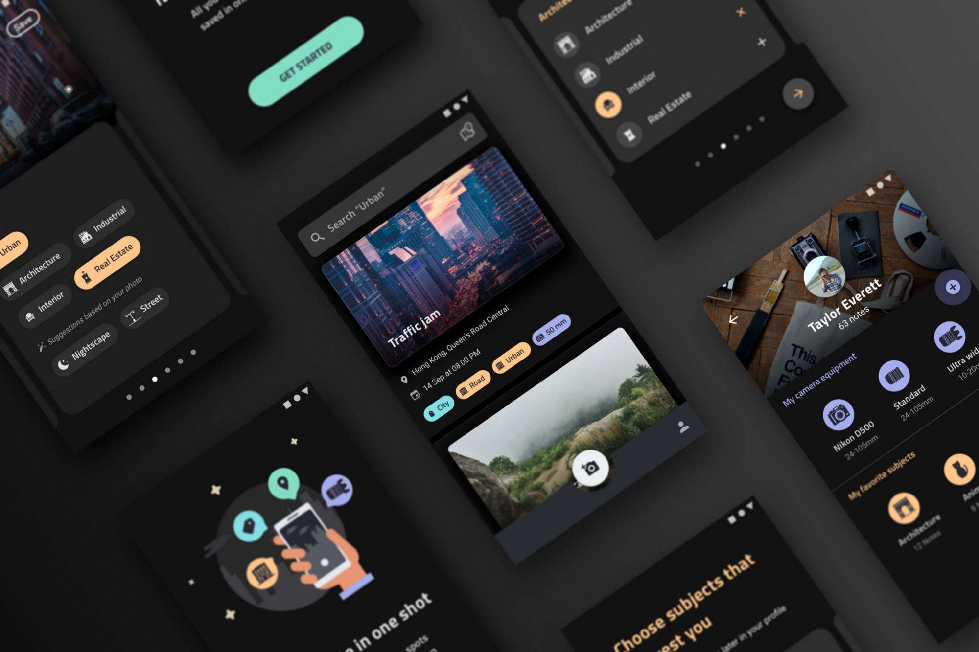
Using dark mode in design
Dark mode design can work anywhere. From mobile apps, smartwatches, TV interfaces, or websites, this design trend can move your brand forward and elevate your user experience. Here are some top tips when designing a dark theme website or app interface:
Compatibility
Brand colors
If your brand's color palette is dark mode compatible, you're already ten steps ahead. If not, you may want to think twice before going dark. If you have to change your brand to fit the aesthetic, don't consider dark mode; moreover, if your brand needs to use a wide spectrum of colors, consider a lighter UI and not this dark mode trend.
Industry
A dark mode user interface is useful for particular industries that highlight high-energy content paired with a dark background in real life. Think nightlife, auto clubs, and other entertainment-like brands.
Minimalistic
If you are designing a minimalist brand or if your design aesthetic is already minimalistic, consider dark mode as it complements your UX goals.
Branding
Keep it simple. This may be obvious, but take a second or third or fourth look at your brand — do you think your brand could be elevated using dark mode? Yes? Then proceed reading. No? Don't fear missing out. Are your competitors moving toward dark mode? Keep reading, and maybe contact our branding team.
Tips for dark mode design
Is your brand ready? Are you ready? Take notes, research, and apply these tips to ensure your dark mode website or app will be a hit with your users.
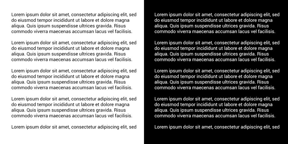
Don't go too dark
Book publishers don’t use pure white paper because the contrast with black ink is too stark. It makes you squint and can lead to headaches. The same goes for digital devices. Steer clear of pure black. It’s hard on the eyes to look at a high contrast screen. Good dark mode colors are shades of grey combined with desaturated colors.
Contrast
Dark mode backgrounds have to be dark enough to show white text. The suggestion from Google Material Design is to use a text-to-background contrast level of at least 15.8:1.
Colors
Keep away from fully saturated colors on dark backgrounds. The shades often seem to “vibrate” when viewed on dark surfaces. Instead, use desaturated colors like pastels and muted colors—shades that have grey and white added.
Also, consider adjusting your brand’s color palette. Your company’s blue might read differently on black than on white. Colors in dark mode often have to be tweaked to elicit the same response you’d get in light mode.
Use active/non-active indicators
What’s an “on” color? One that shows up on top of elements and key surfaces. “On” colors are usually used for lettering. Dark mode UI default “on” color is pure white (#FFFFFF). Don’t use it. Pure white appears too vibrate when viewed against dark backgrounds. We suggesting using a light grey.
A beginner's mistake
If you’re switching to dark mode from standard mode, there are probably valuable visual cues in the original theme. Don’t simply invert the colors to get your dark theme. You might be turning colors that had a psychological purpose into meaningless muted colors. Be intentional about your color selection.
Layer
The higher a layer is, the lighter it should be. This will create a visual hierarchy in dark mode that goes from the most used elements in your display to the least.
Enable/Disable
Test both dark and light mode versions of your design. Experiment with each style and make the appropriate tweaks based on user feedback. Ultimately, people’s preferences can be unpredictable, so don’t pigeon-hole your users. Let them toggle their display from light mode to dark mode. This gives users the chance to control their own experience and let them feel more like an individual.
Ready, set, go-dark!
Although dark mode UI has been around, we feel that the theme revolution is just getting fired up, meaning it’s the perfect time to dim the lights and get creative.
Need help? Simple Digital has an immersive experience with dark mode UI design and dark mode re-branding. Give our team a call or send us an email to learn more!
There you have it, 5 web design trends for 2020 and beyond! With a decade of old trends having come to a close and a decade ahead open to attention-grabbing visuals, you can expect the minimalistic movement and user time-span epidemic to make 2020 and beyond very interesting for web designers.